Vehicle graph
In the vehicle graph area, you have the option of displaying vehicle data in graphical form for a period of your choice.
The window is divided into three sections:
Left side
Center
Right side
Left side:
In the left-hand section you will see the vehicle selection. Here you have the option of applying various filters to find your vehicles. You can find out how to apply, create and activate filters here.
If you have now successfully found your vehicles, you can decide which ones you would like to display in the graphic. Click on the  -button to display your vehicle in the graphic. To remove your vehicle from the graphic,
click on the  -button again.
Click on the  -button to open a new tab in your browser where you can edit the vehicle data.
Click on the  -button to go to the vehicle view. A new tab will open in your browser.
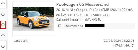
If you move the mouse over the  , the vehicle's general information is displayed on an info card.
Center:
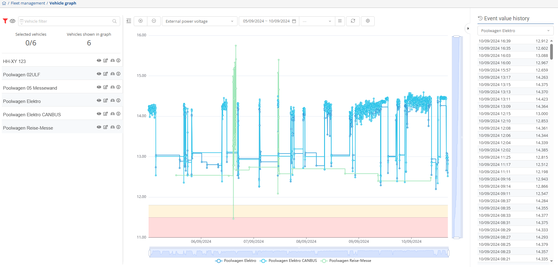
In the center you will see the diagram of a measured value of the previously selected vehicle.
Click on the  -button to hide the left-hand side and enlarge the diagram. This provides a better view of the diagram.
You can use the  -button to display all vehicles from the list in the graphic. The maximum number of vehicles to be displayed is 30. To remove all vehicles from the graphic, click the
  -button. All vehicles are then moved back into the list.
You can use the drop-down menu  to select which data should be visualized in the diagram. Simply select the corresponding FMS type from the list.
Click on the  -icon to open a calendar where you can select a time period. To select a preconfigured time interval, select the corresponding interval from the drop-down menu
 . You can use the
  -button to adjust the preconfigured time intervals.
The customized settings are updated via the  -button.
You can adjust and personalize the FMS values by clicking on the  -button.
There are gray bars to the right of the diagram and below it. If you grab the ends of these and drag them, you can further limit the time interval manually.

If you display several vehicles in a diagram, there is a legend below the diagram to differentiate between the vehicles.

Right:
You can use the  -button to show or hide the event history. In the event history, you can now select the desired object/vehicle from the drop-down menu and view the history.

You can see from the red arrow  that the critical lower limit has been reached. You can adjust the lower and upper limits in the FMS settings.
If the arrow  is yellow, it means that the lower limit has been reached.